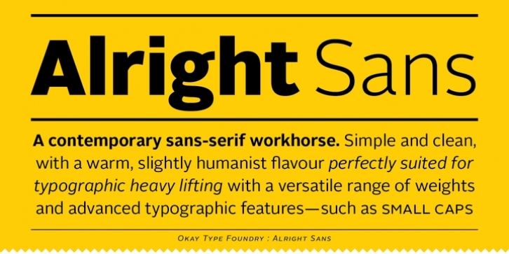
Alright Sans is a contemporary sans-serif. Inspired by both grotesque and humanist models, it’s clean and prudent with a warm, friendly tone.
Alright Sans is a modest design that doesn’t feel at all stiff or bland. It has open apertures and roundabout economy that works exceptionally well across media and at reduced sizes. And with shorter-than-normal capitals and a tall x-height, it’s functional without becoming distracting, goofy, or unprofessional.
Extra care was taken in creating the OpenType features in Alright Sans. Details were included to help make high-quality typesetting easier, such as case-sensitive punctuation and an optically-correct superscript. A stylistic set in the italics provides alternate two-story forms of the ‘a’ and ‘g’. Even the default numbers are the proportional width old-style forms for a more refined all-around text appearance. There are also lining figures for setting with caps and tabular-width versions for setting tables.
Every style of Alright Sans also has a full set of built-in small caps, even the italics. There is also an expanded character set, supporting over a hundred languages. And with weights ranging from extra thin to ultra heavy, Alright Sans proves itself to be a versatile and useful family for a wide range of projects.

