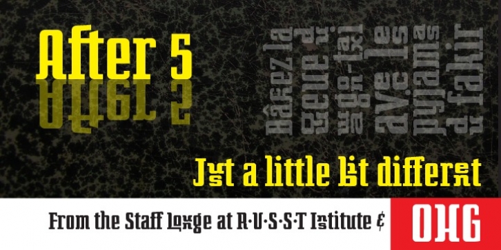
After 5 was designed by Russell McGorman and published by Our House Graphics. After 5 contains 2 styles and family package options.
From the basement labs and after hours lounge of R∙U∙S∙S∙T Institute, we present After 5. With a somewhat formal (ha ha) yet warm, friendly feel, its normally calm, even tempered and sensible rhythm takes on the syncopated, jazzy beat that goes along with too many martinis when discretionary ligatures are turned on.
A friend once asked, was I trying to design a font that looked sort of “Korean?” I said, no. That would be culturally insensitive. I was trying to mess up the Latin alphabet. So, here it is: After 5, a bold, upright condensed slab-serif display typeface with a mixed-up attitude. Complete with bold roman and matching italics.
This attention getting font is ideal for Posters, headlines, Packaging and logos.

