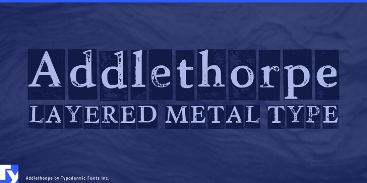
Addlethorpe was designed by Ray Larabie and published by Typodermic. Addlethorpe contains 4 styles and family package options.
Addlethorpe is a metal font in three layers.
Addlethorpe 1 is the foreground layer. If you’re using Addlethorpe on a light background, this may be all you need.
Addlethorpe 2 is a fill layer designed to color the raised letters.
Addlethorpe 3 is a rectangular background layer designed to fill in everything else.
In OpenType savvy applications you can choose lining or old-style numerals; letter pair autoligs help break up the monotony of obviously repeating letters. Addlethorpe is based on Winthorpe.
Addlethorpe 1 is very detailed. Be patient with your application: scaling Addlethorpe takes a lot of computing power.
Addlethorpe Web has simpler shapes and a more limited glyph set. It’s better suited to applications where quicker load times are needed such as Flash, web embedding etc.

