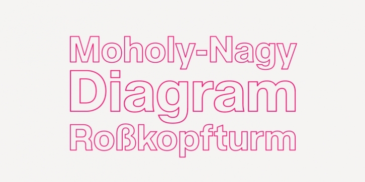
Acronym Outline is a unique display variant that was produced manually, utlilizing Acronym’s assertive Extrabold weight as its foundation. It adheres to the same level of detail and refinement realized in Acronym, employing a relatively monoline stroke that has been subtley tapered, clipped, and altered to accomodate the conversion.
The three available weights (thin, light, regular) effectively act as grades, considering the letter width and spacing remains constant throughout each separate style. Designed to accomodate a range of display sizes, these ‘grades’ can be interchanged without causing critical shifts in word or line spacing.
Features include:
Precision kerning
Standard Ligatures set including ‘f’ ligatures (ff, fi, fj, fl, ffi, ffj, ffl, ae, oe, AE, OE)
Discretionary Ligatures set including (No [numero])
Alternate characters (R, Aringacute, hcircumflex, and numero sign)
Case forms (shifts various punctuation marks up to a position that works better with all-capital sequences)
Capital Spacing (globally adjusts inter-glyph spacing for all-capital text)
Slashed zero
Full set of numerators/denominators superior/inferior numerals
Automatic fraction feature (supports any fraction combination)
Extended language support (Latin-1 and Latin Extended-A)
*Requires an application with OpenType and/or Unicode support.

