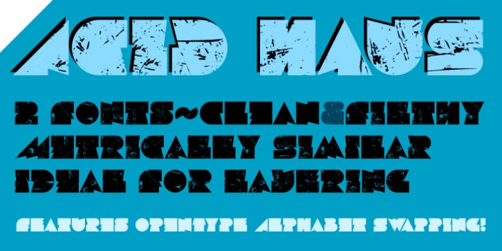
Acid Haus was designed by Dave Rowland and published by Schizotype. Acid Haus contains 2 styles and family package options.
Acid Haus is a fat, geometric face inspired in equal measure by 1920s Bauhaus geometric design and 1980s rave culture.
It comes in two flavors, clean and filthy. One is tight and sharp, the other eroded and grungy. Because both are metrically similar, they can be overlapped to great effect. Both styles include an OpenType alphabet-swapping feature, that automatically switches between the two alphabets (when contextual alternates are enabled) to give the text a more handmade look, and to ensure double letter combinations like BB, DD, TT etc. come out as two different glyphs. There are alternate start and end forms of the triangular letters (A, M, V and W), which are substituted automatically as you type.
Obviously a display only font, on the border of legibility, it would look great on T-Shirts or record covers.

