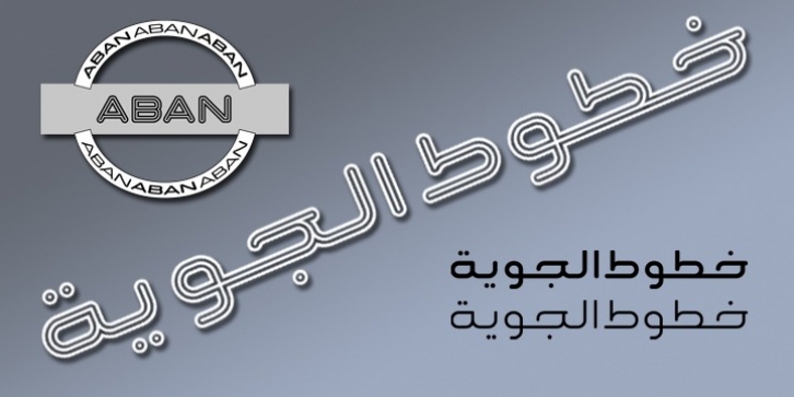
Aban was designed by Naghi Naghashian and published by Naghi Naghachian. Aban contains 3 styles and family package options.
The Aban font family was designed by Naghi Naghashian. It is developed on the basis of specific research and analysis on Arabic characters and definition of their structure. This innovation is a contribution to modernization of Arabic typography, gives the font design of Arabic letters real typographic arrangement and provides more typographic flexibility. This step was necessary after more than two hundred years of relative stagnation in Arabic font design.
Aban supports Arabic, Persian, and Urdu. It also includes proportional and tabular numerals for the supported languages. Aban Font Family is available in three weights: Regular, Bold and ExtraBold, a three stings outline font.
The Aban design fulfills the following needs:
A tExplicitly crafted for use in electronic media fulfills the demands of electronic communication. Aban is not based on any pre-digital typefaces. It is not a revival. Rather, its forms were created with today’s technology in mind.
B tSuitability for multiple applications. Gives the widest potential acceptability.
C tExtreme legibility not only in small sizes, but also when the type is filtered or skewed, e.g., in Photoshop or Illustrator. Aban‘s simplified forms may be artificial obliqued in InDesign or Illustrator, without any loss in quality for the effected text.
D tAn attractive typographic image. Aban was developed for multiple languages and writing conventions.
E tThe highest degree of geometric clarity and the necessary amount of calligraphic references. This typeface offers a fine balance between calligraphic tradition and the contemporary sans serif aesthetic now common in Latin typography.

