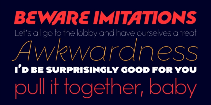
Mimolette Font Family was designed by DC Scarpelli, and and published by The Ampersand Forest. Mimolette contains 14 styles and family package options.
Every designer has a favorite geometric sans serif. For a century, they’ve been a staple for text that needs to be clear, strong, architectural, and objective.
Mimolette offers a sans serif family that’s great for text and display alike-the panache of Neutraface, the readability of Avenir, the sleekness of Avant Garde, the strength of Mark, the architecture of Gotham, and the classic lines of Futura-but she’s entirely her own creature, and she’s designed to offer maximum versatility and beauty at an affordable price.
And she’s got some nifty features, too!
Her italic is a true italic, not just an oblique.
Are the uberpointy diagonals (AMVW) not working in a particular context? Activate Stylistic Set 01, and they become flat-topped!
Want more playful cursive alternatives in the italic? Activate Stylistic Set 02, and you’ve got them in the A, E, K, Q, R, and k.
She’s got true small caps in all styles!
She’s got true fractions in all styles, as well as oldstyle (small cap) and lining numerals, in both tabular and proportional widths.
Best of all, perhaps, Mimolette was made with love, as always, by yer pals in the Ampersand Forest.

