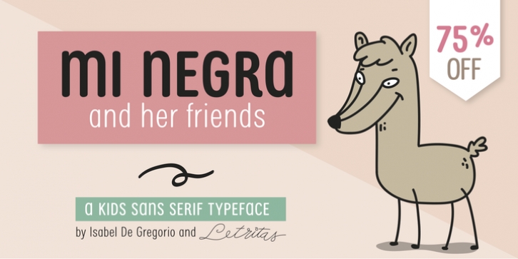
Mi Negra was designed by Isabel De Gregorio and published by Letritas . Mi Negra contains 4 styles and family package options.
Mi negra is a funny and hilarious typography designed especially for children, thought and created by Isabel de Gregorio.
It could be described as an original combination between a semi-handwright and semi sans-serif font. Thanks to its structure and nice endings ‘Mi Negra‘ is recommended for composing short texts (logotypes, packing, posters, etc.). It may similarly be used for illustrations and comics, as well as in printing press works for children from 6 to 13 years old for instance.
Mi Negra has been conceived to be a useful support in all kinds of illustrations works (please note that Isabel, the type designer, considers herself primarily an illustrator). The font designer of Mi Negra tells that every time she needed to provide some text data (i.e. in children infographies) and needed to make them more understandable and suitable for children, she used this typography. The former idea was than to create a font who could be a second option to comic sans, but as the project started to reveal its forms, it was clear that it was revealing another connotation and its own character. In this way, Mi Negra went on modifying its forms and the more it developed, the more it was showing its new characteristics and concepts.
The family is composed of three weighs: Light, regular and black. It provides also interesting functional ligatures. It also includes a dingbat with nice doggies. It has 434 characters and can work with 208 languages.

