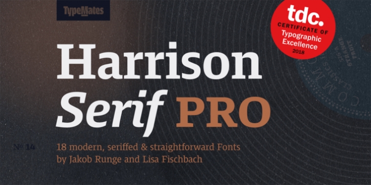
Harrison Serif Pro was designed by Jakob Runge, Lisa Fischbach and published by TypeMates. Harrison Serif Pro contains 18 styles and family package options.
Harrison Serif Pro is a sturdy yet contrasted slab serif that combines a rational and efficient approach with a warm voice. A typeface of nuances, the slightly carved and occasionally extended serifs evoke the friendly side of Harrison Serif and contrast with the straightforward nature of the typeface’s squarish curves, open counters and horizontal emphasis.
Harrison was drawn for long form reading on screens and user interfaces, but the typeface’s more refined details come alive in high-resolution media and print. The almost mechanical vertical terminals, open counters and modest capitals combine with Harrison’s generous x-height to ensure the typeface holds up on screen. With improved ClearType hinting and a sturdy physique, no medium is a worry for this serif typeface.
Harrison Serif’s broad range of weights means that it’s more than a just a simple text face. From sheer Hairline to deep, dark Ultra, its weight spectrum is divided into nine distinct styles – leaving no need unfulfilled for editorial designers.
Further, Harrison explores nuance in its italics. Something between true italics and obliques, they range from the cursive to the playful, from the expressive to letters with the sobriety of unpretentious slanted obliques.
Of course Harrison provides all the OpenType features needed for ambitious typography: as well as a variety of figure styles, there small caps and the capitals-to-small caps feature. And you can have no doubt that it contains broad Latin language support and a set of helpful symbols.
Selected for a Certificate of Typographic Excellence by the Type Directors Club in 2018.

