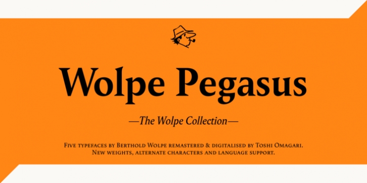
Wolpe Pegasus was designed by Berthold Wolpe, Toshi Omagari and published by Monotype. Wolpe Pegasus contains 4 styles and family package options.
Wolpe Pegasus is full of surprises. Some characters have oversized serifs, others have very different weights, and some even look inconsistent with the other characters in the set. “This is the typeface that taught me a lesson,” says Toshi Omagari, who revived the design for The Wolpe Collection. “You don’t have to be super-precise in the design of every character, it can still work.” Omagari kept every convention-defying detail of the original Pegasus design, adding only a set of small capitals and an italic for each weight.
Wolpe Pegasus makes for a distinctive text typeface in books, journals and a variety of online content. Each letter looks as if it was honed by hand. Side by side in words and blocks of copy, however, they work beautifully.

