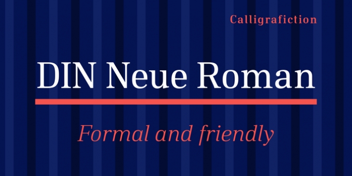
DIN Neue Roman was designed by Philip Lammert and published by Calligrafiction. DIN Neue Roman contains 14 styles and family package options.
The DIN Neue Roman adds something new to the established concept of the DIN 1451 type’s technical origin. As a serif counterpart it leaves its static appeal to bring some friendliness into this industrial idea. With more contrast than a slab serif and the dynamic stroke of transitional type DIN Neue Roman defies all conventions, but keeps its legibility.
To have enough resources for diverse and complex typography this type family offers 7 weights with italics, small caps and all kind of opentype features.
Type designer Philip Lammert likes to play with the great potential of contradictions. That brought him to this design combining two essentially different classics. DIN Neue Roman is part of his 2015’s master thesis at the HAW Hamburg which was supervised by Prof. Jovica Veljovic.

