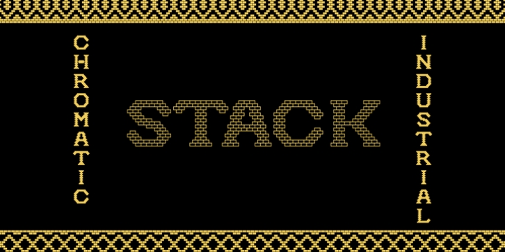
Stack was designed by James Todd and published by James Todd. Stack contains 5 styles and family package options.
Stack brings the spirit of industrial chimney lettering from the early twentieth century to the digital age.
The typeface is designed to work both horizontally and vertically. Additionally, the fonts can work together in myriad chromatic expressions-providing limitless design possibilities.
The family is true to the spirit of masonry lettering without being a direct lift of any specific lettering style from the industrial age. Like some of its masonry predecessors Stack is built as a typeface of 15 courses (horizontal rows) of ‘bricks.’
Based on several years of research a collection of 150+ photographs and roughly two dozen archival engineering drawings were amassed. The value of the historical references is a type family that is a legitimate reflection of masonry lettering styles of the period.
In updating Stack for the digital age, the proportions of the base-unit ‘bricks’ and the thickness of ‘mortar’ joints have been optically adjusted to work in both screen-based and print media.
Stack would not have been possible without the research and design input from Craig Welsh and Jenna Flickinger of GoWelsh.

