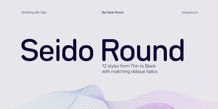
Bw Seido Round was designed by Alberto Romanos and published by Branding with Type. Bw Seido Round contains 12 styles and family package options.
Designed by Alberto Romanos, Bw Seido Round is a semi condensed font family with rounded corners striking a gentle balance between minimal strict geometry and typographic refinement, conveying a subtle industrial yet friendly feel. It consist of 12 styles (6 uprights + 6 matching obliques) supporting all European Latin languages.
The design of Bw Seido Round started heavily Influenced by the systematic principles behind the original German DIN 1451, with its clean, minimal shapes and rigid geometric feel: Both the lowercase and the uppercase have their own horizontal waistline running through all the characters of the font, reinforcing the engineered feel and focusing the rhythm on its vertical pace.
Beyond the very obvious rounded corners and terminals, which are instantly softening the feel and positioning this font on the friendly side, Bw Seido Round presents a series of subtle typographic adjustments elevating the design while staying invisible: The monoline look is achieved seamlessly thanks to the subtle modulation and the corrections at the joins; the tall x-height married with the open counters and the unambiguous shapes make it a very legible font,… All these ingredients play a balancing game with the crude geometry by adding the right doses of warmth into the industrial feel.
The resulting combination is a very functional font family suited for carrying the weight of a contemporary brand’s visual identity. Its tabular figures feature includes currency symbols and punctuation, making it a great candidate for information design and annual reports. Bw Seido Round is equally comfortable in print as it is in digital environments, thanks to the additional symbols and arrows included matching each weight. Other OpenType features included on the Bw Seido Round font family are stylistic alternates, slashed zero, fractions, case sensitive and localized forms.

