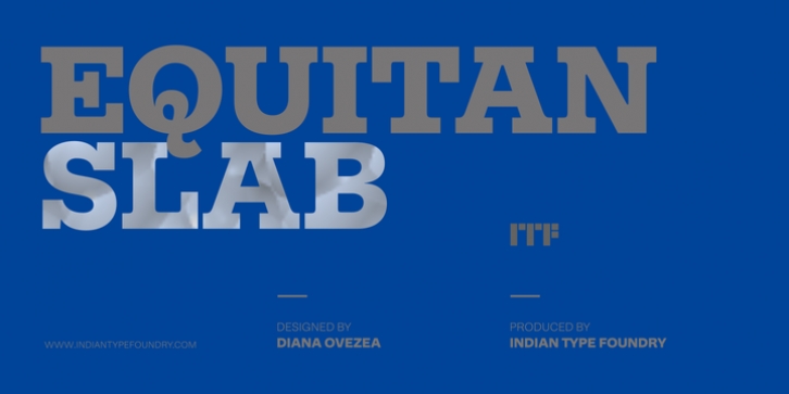
Equitan Slab was designed by Diana Ovezea and published by Indian Type Foundry. Equitan Slab contains 14 styles and family package options.
Part of the Equitan super family, Equitan Sans and Equitan Slab are ready for branding projects and packaging design. They serve up industrial-era letterforms, refreshed for a new century. Each of the seven weights has an upright and a true italic, with 418 glyphs per font. Equitan Slab‘s uppercase letters create an almost woven pattern when set together, due to their oversized serifs. The italics follow suit, and include long out-strokes. These curls create a playful take on recognisable elements of the ‘Scotch Roman’ genre. Wherever possible, counterforms are round, such as in b, d, p, q, 6, or 9; even the bottom of the ‘g’ has an atypically rounded counterform, and its ear curls up in a very noble manner. The default numeral style in all 14 fonts are proportional oldstyle figures. Thanks to OpenType features, tabular versions are also available, as well as lining figures. The typeface’s most striking characters are the arched-up legs of the capital ‘R’ and lowercase ‘k’, as well as the tail of the capital ‘Q’.

