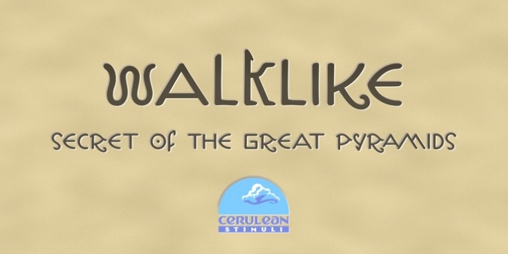
Walklike was designed by K. Pease and published by Cerulean Stimuli. Walklike contains 2 styles and family package options.
You’ve searched for ‘Egyptian’ but, thanks to a quirk of type jargon history, much of what you found is not what you had in mind for the voice of Thoth in your comic book, or the hints in your Mummy’s Tomb game. And you don’t want to fall back on You-Know-What. Fear not; now there’s Walklike! Pyramids, reeds, the Eye of Horus, and other recognizable symbols inspire the letterforms of Walklike to create the feel of Ancient Egyptian hieroglyphs while remaining fully legible. The strokes are casual but careful, at home in ink or stone alike, and kept interesting and natural-looking automatically with ligatures and some contextual alternates. The air of ancient mystery is unmistakable!

