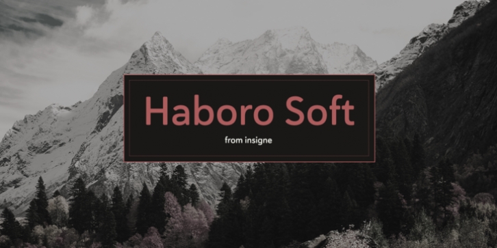
Haboro Soft was designed by Jeremy Dooley and published by insigne. Haboro Soft contains 42 styles and family package options.
Stop trekking through the thick, wintery font forest, and step lightly into the fresh life of the Haboro hyperfamily.
Though simple in nature, the Haboro hyperfamily provides you with a variety of options. Take, for instance, Haboro Soft, the latest member. Soft features a clean, geometric shape based off Haboro Sans. Unlike Sans, however, Soft’s blunted terminals give your work a more contemporary appearance. It’s a gentle touch for those times you prefer subtilty over pounding your message home.
Take Haboro Soft even farther with its OpenType features. The typeface contains specially shaped small caps and old-fashioned figures–just enough to give your work a unique touch. Of course, for more options, use the entire Haboro hyperfamily to expand your abilities.
Enjoy the comfort in knowing you’re choosing a font family equipped with tools for most anything: packaging, branding, web pages, iPhone apps and more. Its simplicity lends itself to achieve perfect results. And yes, your work will even thank you.

