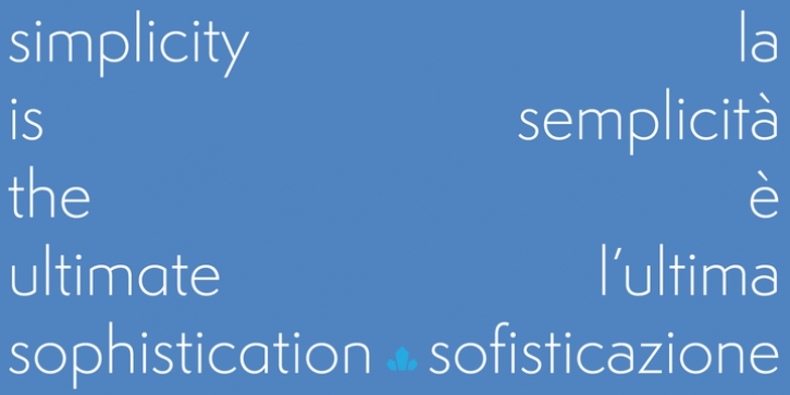
Semplicita Pro was designed by Alessandro Butti, Patrick Griffin, Bill Troop and published by Canada Type. Semplicita Pro contains 10 styles and family package options.
Semplicita Pro is a new sans serif design that effortlessly straddles the tri-cornered divide among the geometric, humanist, and gothic sans serifs. We started by reappraising Semplicità , Alessandro Butti’s important 1930 design for Nebiolo. Fueled by Futura, Semplicità gave us the clue to the future: Replace the cool geometric Teutonic soul of Futura with the warm, humanist, calligraphic letterforms that are characteristic not of the Bauhaus but of the Italian Renaissance. With its radically revised formal structure, where only a few characters have a hint of geometric perfection, and the rest are drawn in a calligraphic manner, Semplicità is buzzing with ideas and has served as a gene pool for several new typefaces over the last two decades.
Yet Semplicita Pro goes its own way. It isn’t a simple revival of Semplicità , which would have looked like a period piece. We wanted to use it to solve a practical puzzle: How to make modernist sans serif letterforms truly readable at small sizes yet persuasive as message-carriers in display. We decided to keep its calligraphic soul and even emphasize it in places, and to relegate to alternatives all the features that seemed to be over-exaggerated, over-decorative, or simply non-functional.
The result is an intensely readable sans serif design that, while obviously new and clearly stylish, provides the high comfort factor readers experience when viewing the classic stalwarts of 20th century sans serif design, and gives contemporary designers a widely expressive palette, all within the principle of simplicity leading to better understanding.
Semplicita Pro is loaded with OpenType features and over 850 glyphs per font. For more information on the design, complete character sets, technological features, and print tests, consult the accompanying PDF.

