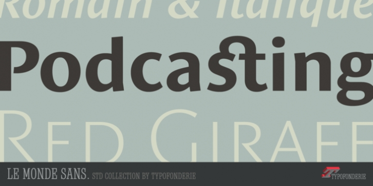
Le Monde Sans Std was designed by Jean Porchez and published by Typofonderie. Le Monde Sans Std contains 18 styles and family package options.
9 weights in romans plus italics.
Designed by Jean François Porchez, Le Monde Sans is a sanserif based on Le Monde Journal — a practice that became commonplace from early nineties. Designed originally in 1994 for the Le Monde newspapers, it was expanded over the years to the large family we know today. As many other members of the extensive Le Monde family, Le Monde Sans was revamped for the relaunch of Typofonderie website. Le Monde Sans is offered in numerous weights — nine in total, in roman, italic to meet all kinds of situations. Several intermediate weights added such as the Book and ExtraDemi have been added. It will help designers to select the best weights depending their needs, from glossy paper printing to high resolution screen as the recent iPad and its retina screen.
The design of Le Monde Sans continues the basic common structure found in the members of the Le Monde family: its proportions, a relatively narrow width, a fairly oblique axis, etc. The typographer can, at all times, switch between Sans & Journal or Courrier without any disruption in the composition.
This family was designed in 1994 as custom typeface family for the French newspaper Le Monde. The family has not been used by this newspaper since November 2005.

