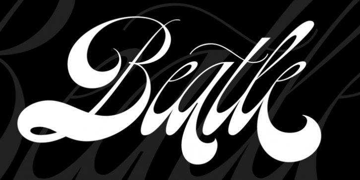
Beatle was designed by Maximiliano Sproviero and published by Lián Types. Beatle contains 2 styles and family package options.
What if Platt R. Spencer and Charles P. Zaner were born in mid-20th Century? What if instead of Beethoven or Chopin they were fan of The Beatles or maybe The Mamas & Papas?
Beatle is what I think those masters would have made with their hands if they were influenced by music of our 60s. Letters shouting for peace, like a true hippie does, with a lot of elegance.
In the 1960s and 1970s “typography” suffered a dramatic change. Sometimes influenced by hallucinogens and the psychedelia movement, artists started to break some rules of type by giving letters a lot of movement. They would change their proportions, play with the baseline and the logic of distribution of weights.
With Beatle I wanted to mix the delicacy of engrossers script with the exuberance of flower power. Since hippies clearly don’t follow really strict rules, I found that neither did letters from that era. Or, at least, there are not many (if any) guides of lettering which explain how to do them out there.
The result is a font designed with a lot of freedom; filled up with provocative alternates and fat tails.
Enjoy it and of course, let it be.

