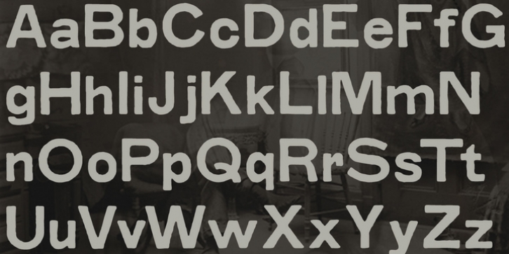
Grit Sans was designed by Nathan Williams and published by Baseline Fonts. Grit Sans contains 2 styles and family package options.
Grit Sans is a font balanced enough to stand strong on the tippy-toes of its pointed ‘t’ ascenders. Even all caps communicates calm. Dashes of whimsy in the proportionately plump X-Heights tell of the accountant drinking too much sherry at the office Christmas party, but thick, consistent strokes never lets you forget his job title. Ascenders and descenders consistently reach the same heights and depths, further attesting to the reliability of this typeface, at even very small sizes.
Available in both regular and bold face, Grit Sans is a faithful complement to thin fonts with a pinch of frivolity such as Heirloom Artcraft. It is ideal in use for titles, subheadings, menus, playbills, custom stamps, logos – anywhere a solid font can speak at a volume just above all others.

