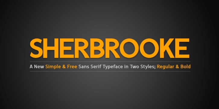
Sherbrooke was designed by Eyad Al-Samman and published by Eyad Al-Samman. Sherbrooke contains 2 styles and family package options.
‘Sherbrooke‘ is a simple and sans serif font. I have chosen the name of this typeface after the ‘Sherbrooke‘ Street in Montreal, Canada, that I daily walked in for several months in the late 2005 while I was studying in Montreal, Quebec, Canada. I do adore this street and also I adore the whole city of Montreal.
This font comes in two different weights. ‘Sherbrooke‘ can be used in wide fields of publications such as the titles of novels, literary texts, short stories, dictionaries, books, newspapers, websites, and magazines. It is suitable for T-shirts, mugs, advertisement light boards in malls, subtitles of movies, logos, cans of foods, and medicines’ names. The font is more attractive when it is printed in calendars and for displaying the contents and paragraphs of electronic encyclopedias and different online websites.
‘Sherbrooke‘ is specifically designed for educational, journalistic, literary, and social purposes. The main characteristics of ‘Sherbrooke‘ Typeface are in its sans serif new designed letters and also in its lowercase special numerals. I think that these characteristics have made ‘Sherbrooke‘ exceptionally unique with its alphanumeric combinations. You can enjoy this typeface and use it anywhere at any product or service. It is simply gratuitous for all.
The word ‘Sherbrooke‘ is a person’s name. Sherbrooke Street – officially Rue Sherbrooke – is a major east-west artery at 31.3 kilometers in length and it is the second longest street on the Island of Montreal in Canada. The street is named for John Coape Sherbrooke, the Governor General of British North America from 1816 to 1818.

