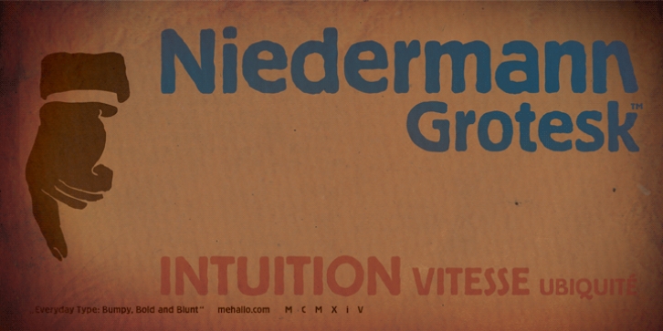
Niedermann Grotesk was designed by steve mehallo and published by steve mehallo. Niedermann Grotesk contains 1 style.
With the printing of the Futurist poem “Zang Tumb Tuuum” in 1914, modern art had taken a typographic twist: “words in freedom” (parole in libertà ) were now a major part of the art world. The avant garde followed suit.
Niedermann Grotesk is based on the everyday type that appeared in early modernist collages, journals and manifestos. It is a peculiar style of lettering-which was originally inspired by the Sachplakat (object poster) work of Lucian Bernhard-and adapted for hot metal in 1908 by Heinz Hoffmann. 100 years ago, the style became a workhorse of the German printing industry.
Niedermann Grotesk is an updated variant, referencing the original poster art, each letter carefully drawn with an old brush. Bumpy, bold and blunt-with a suite of alternate characters and a few dingbats-Niedermann Grotesk is perfect for advertising, packaging, poetry, art, protests and retro homage.

