Akceler was designed by Andrej Dieneš and published by Adtypo. Akceler contains 24 styles and family package options.
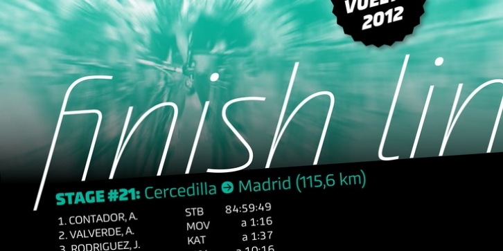
Many sport publications missed typefaces designed especially for sport communication conditions. We usually see only mechanically slanted or other synthetically destroyed standard typefaces. I want to fill in this space and create a system of fonts, that will be used primarily in sport. It is usable for many prints – logotypes, magazines, catalogues, posters etc. Elasticity of glyphs reflected an adrenalinous shapes of latest bikeframes, skies or sportcars. Maximum open arches guaranteed good readability in very small sizes and prevented interchanges of glyphs „o, c, e” per poor reading conditions. Softness of lowercase is at uppercase balanced in bottom arches, that are subtly kicked-up. Numerals are an important component of sport communication, so this font offers expressive design, different from numerals of book typefaces. Every font has 9 kinds of numerals. Character case contains over 1000 glyphs, sport icons and othes signs creating the sport feeling. The font name, Akceler, represents acceleration, which is characteristic attribute of this typeface. It’s suitable for display and text usage, too. To see more please visit the PDF specimen.
â– 24 styles (2 alternatives, 3 grades of dynamics, 4 weights)
â– over 1 000 glyphs per font
â– 9 kinds of numerals
â– icons of sport equipment
â– 8 stylistic sets
â– 8 kinds of arrows
â– 23 OT features
â– support of latin languages