A New Modern
Modern typefaces, such as Bodoni and Didot have been the quintessential faces of fashion for nearly two centuries. With high contrast, flat serifs, and horizontal stress, this combination exudes confidence and elegance.
Today, Sans-Serif typefaces have become the new standard for the description of modern. Clean lines, extremely thin weights, and rational forms are common in fashion and design today. With this in mind, are Modern typefaces like Bodoni still the standard? Yves Saint Laurent said: “Fashions fade, style is eternal.†Is there a way to move Bodoni forward, while maintaining the inherent style?
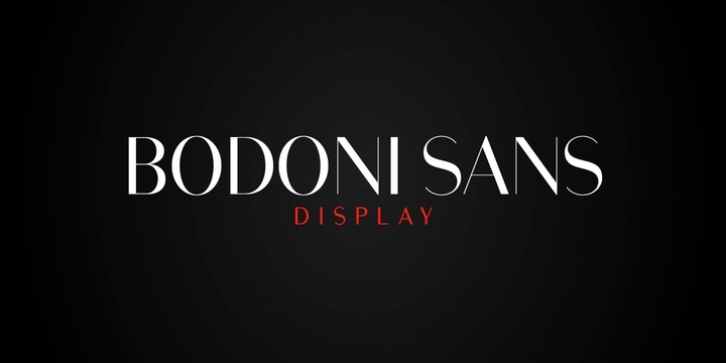
Bodoni Sans moves forward by removing the serifs, while maintaining the high contrast and elegant curves. Although, these fonts are more than just chopping off the serifs. Several cuts of Bodoni were compared, and collectively used as a base. The classical proportions of the capitals and x-heights were maintained, but the letterforms were rebalanced for use without serifs. Contemporary modifications were made to some widths, as well as an all new Light weight was created. The letterforms were also engineered with a reductive bezier point method, for optimal performance. Together these updates to the classic provide a truly modern look.
High contrast is the key feature of Bodoni Sans. To maintain this contrast over a wide range of sizes, three optical sizes were drawn: Standard, Display and Text. Contrast adjustments were made for each optical size for optimal performance. The Standard was designed for the mid range of 12 to 60pt, Display for 48pt and above, and Text for 6 to 12pt.
Web/Digital use was also considered while developing Bodoni Sans. The fonts were tested as web formats, and examined on a variety of screens, to ensure seamless use in both print and digital applications.
Bodoni Sans is a new classic built on the foundation of two centuries of history. Fresh and contemporary, while feeling familiar. Stylish and sophisticated, Bodoni Sans is a new Modern.

