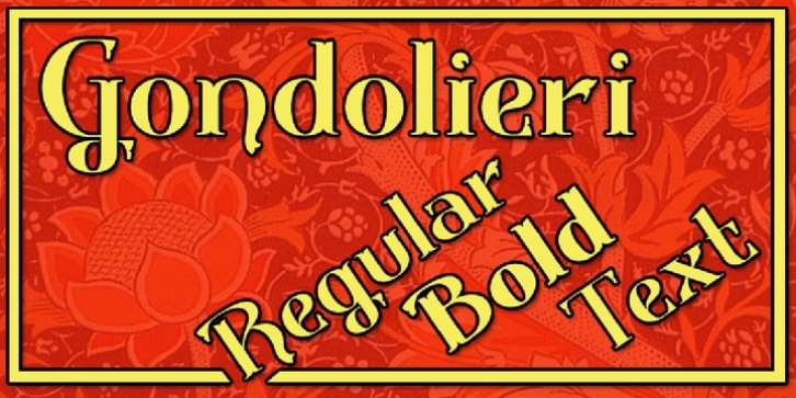
Gondolieri was designed by Paul Lloyd and published by Greater Albion Typefounders. Gondolieri contains 9 styles and family package options.
The design of Gondolieri has its origins in an experiment to combine aspects of Didone and Tuscan typefaces. The result has a continental ‘Italianate’ feel. If you wonder what lies behind the name, just look at the lower case ‘f’…definite overtones of a Venetian Gondola here, and throughout the design.
Gondolieri is offered in regular and bold weights, as well as a simplified form for smaller text use. All of these are available in three widths. The Gondolieri family has a lovely Didone, ‘Belle Epoch’ feel for use in design, posters, book covers and so forth. An extensive range of Opentype features, including ligatures and terminal forms is included in the regular and bold faces.

