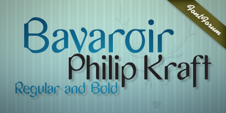
Bavaroir was designed by Philip Kraft and published by URW Type Foundry. Bavaroir contains 2 styles and family package options.
Bavaroir looks like a techno party in the throne room of Neuschwanstein: grandiose, original and still high-tech, modern, stylish and chic… anything but lifeless.
The design experiment was to create a sans serif based on ‘dropping endings’. Something between elegance and protest, Bavaroir coquettishly hides its edges. Although pretty narrow in design, Bavaroir still flows easily, openly and well readably, even in very small sizes.
Bavaoir was designed for the URW++ FontForum.

