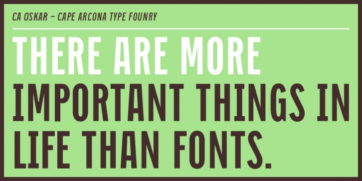
CA Oskar was designed by Stefan Claudius and published by Cape-Arcona. CA Oskar contains 8 styles and family package options.
CA Oskar came into being as a custom typeface for the international Traumzeit music festival. As a substantial part of the new corporate identity, it had to be characteristic, but also flexible in use. Starting with the design of compressed caps for headlines, the typeface was soon expanded by a condensed weight for setting of text and further developed into a fully functional font with two widths and two weights. Both weights are very space-efficient, which was — apart from aesthetic considerations — an important issue in the process of the design.
CA Oskar is a mixture of industrial harshness and friendly round forms, reflecting the spirit of fusion, which is basically what the whole festival is about. Its very slim proportions in two widths make it an attractive alternative to fonts like Alternate Gothic, but CA Oskar adds an extra portion of personality and a coherent choice of weights.

