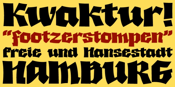
Kwaktur was designed by Dave Rowland and published by Schizotype. Kwaktur contains 3 styles and family package options.
Kwaktur began as an attempt to make a whole typeface from the letters in the logo for an obscure Belgian beer called Kwak. Through my naive approach, it quickly took on a life of its own and started to look more like a modern graffiti font.
Regular and shadow versions are available, along with shadow only, which can be layered with regular for a two color option. If you’re after an authentic German fraktur font, keep looking! Kwaktur doesn’t take itself too seriously.
There are a few automatic ligatures and kerning for virtually every letter pair you can think of.

