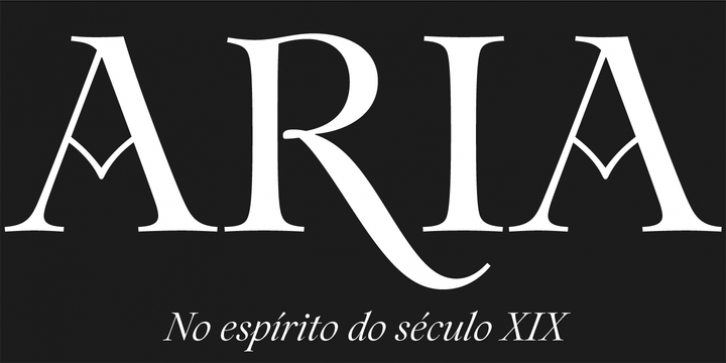
The inspiration for this typeface came from the epigraph on a frame of a nineteenth century painting. I was fascinated by the peculiar capitals of the inscription. The high contrast, and the overall quirkiness, especially the tail of the R and the oblique stems on the M, was interesting. I decided to draw a display font with high contrast and a vertical axis, in a reference to the transitional form. Still I wanted to capture the spirit of the original letters, which to me are so imbued with Romanticism. This approach allowed for some exuberance on the regular style, but also led to more calligraphic letterforms in the italic – in which “the flow of the curves” lead the way. To add to this epigraphic nature there is a number of ornaments that accompany words accordingly to their uppercase or lowercase form. For versatility there’s also a good amount of ligatures, alternative glyphs, and a special set of ornamental numbers.

