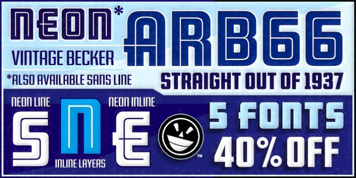
ARB 66 Neon was designed by Alf Becker, Michael Adkins and published by The Fontry. ARB 66 Neon contains 14 styles and family package options.
Beginning in January, 1932, Becker, at the request of then-editor E. Thomas Kelly, supplied SIGNS of the Times magazine’s new Art and Design section with an alphabet a month, a project predicted to last only two years. Misjuding the popularity of the “series,” it instead ran for 27 years, ending finally two months before Becker’s death in 1959, for a grand total of 320 alphabets, a nearly perfect, uninterrupted run. In late 1941, almost ten years after the first alphabet was published, 100 of those alphabets were compiled and published in bookform under the title, “100 Alphabets,” by Alf R. Becker.
As published in June, 1937, this is the description that accompanied Becker’s 66th alphabet, Neonline:
NEONLINE, alphabet No. 66 in Alf R. Becker’s SIGNS of the Times series, is a very bold, modern style for feature display lettering. Care should be taken in the laying out of this alphabet, and every letter should be made as bold as possible.
Well that was a bit of an understatement! Fortunately, this font pak isn’t understated. After the main Neon font was finished, a ton of work went into developing alternate character ranges, a second neon effect, a layering option accessible via the styles menu, and two supplemental fonts for the headlining and text chores. And did I mention the extensive kerning? The finished result is a handy little family that can tackle of wide variety of design needs.
Many font designers have tackled the task of taking Becker’s incredible achievement from paper to digital, and many claim to treat his work with care and dignity. But the Fontry’s Becker fonts remain the most historically accurate and viable treatments available, arriving in two industry-satisfying versions: CAS (Computer-Aided Signmaking) and DTP (Desktop Publishing).

