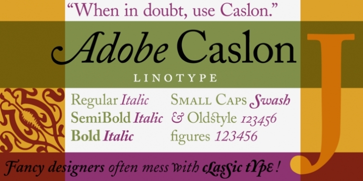
The Englishman William Caslon (1672-1766) first cut his typeface Caslon in 1725. His major influences were the Dutch designers Christoffel van Dijcks and Dirck Voskens. The Caslon font was long known as the script of kings, although on the other side of the political spectrum, the Americans used it as well for their Declaration of Independence. The characteristics of the earlier Renaissance typefaces are only barely detectable. The serifs are finer and the axis of the curvature is almost or completely vertical. The overall impression which Caslon makes is serious, elegant and linear. Next to Baskerville, Caslon is known as the embodiment of the English Baroque-Antiqua and has gone through numerous new interpretations, meaning that every Caslon is slightly different. The Caslon of Carol Twombly appeared with Adobe in 1990. It is an extensive font, including, next to the basic alphabet, alternates for some lower case letters, small caps, swash letter, expert fonts and ornaments. It is relatively true to the original Caslon, although this interpretation is better suited to longer texts. Adobe Caslon, with its ligatures, old style figures and swash letters, makes an elegant and classic impression.

