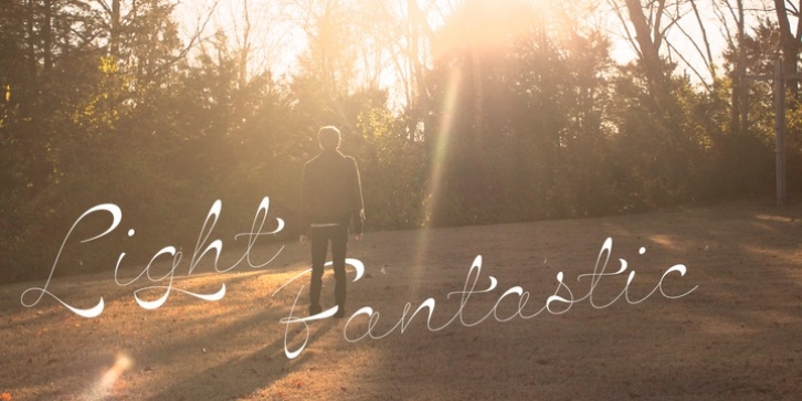
Hazel Script was designed by Dave Rowland and published by Schizotype. Hazel Script contains 1 style.
The design process of this font was rudely interrupted on August 11th, 2015, when my first child, Hazel, was born. Thinking up names for fonts can be tricky, as can thinking up names for babies, so when the font was finally finished, it seemed like a good idea to kill two birds with one stone, and here it is: Hazel Script.
Hazel Script is a finely crafted, elegant, connecting script. I wanted to make something unique, and to this end, the contrast in the face is not based on any ductal logic, or the writing of some imagined tool. The thick parts of glyphs are purely aesthetic devices, placed to give the otherwise monoline font an interesting rhythm.
The over-sized upper case letters follow a mid-century lettering skeleton, and swash forms can be used judiciously to add spice to the text. Hazel Script works ‘out of the box’ but to really get the best out of it, use OpenType-savvy programs to unlock a world of swashes, alternates, ligatures and the like. In detail, the features are as follows:
Swash – alternate forms for many glyphs
Stylistic Sets – 1: script r, 2: alternate s, 3: script z, 4 and 5: more swash options, 4,5,6 and 7: access to alternate ampersands (the font boasts six to choose from!), 8: connecting forms for K, L, R, X and Z.
Localised forms – ij digraphs for Dutch, and a script lslash for Polish.
Standard ligatures – a mixture of ligatures, including the Schizotype signature glyph, ‘percent off’ (just type ‘% off’) and a heart that connects to the ends of words (type ‘
Automatic fractions
Ordinals – a and o for Spanish etc. but also s,t,r,d,h and n for English 1st 2nd and 3rd etc.
Contextual alternates – automatically places special start and end glyphs where necessary.
Hazel Script would look great in glossy magazines set large, or would make a slightly unorthodox choice for wedding stationery, birth announcements, letterheads…

