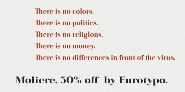
Moliere was designed by Olcar Alcaide and published by Eurotypo. Moliere contains 5 styles and family package options.
The life of Molière is a story of struggle, hard work, domestic unhappiness, death and burial in obscurity and almost in shame.
Molière left behind a body of work that not only changed the face of French classical comedy, but has also come to influence the work of other dramatists from around the world.
Despite his own preference for tragedy, which he had tried to further with the Illustre Théâtre, Molière became famous for his farces, which were generally in one act and performed after the tragedy.
Both the comic and the serious drama were powerfully affected by the work of Molière, not only in his own age and country but everywhere and up to the present time.
Didot is a name given to a group of typefaces named after the famous French printing and type producing family. The classification is known as modern, or Didone. The typeface we know today was based on a collection of related types developed in the period 1784–1811. Firmin Didot cut the letters, and cast them as type in Paris.
Along with Giambattista Bodoni of Italy, Firmin Didot is credited with establishing the use of the ‘Modern’ classification of typefaces. The types that Didot used are characterized by extreme contrast in thick strokes and thin strokes, by the use of hairline serifs and by the vertical stress of the letters.
As in the extreme contrasts of the literature of Molière, in Didione’s typefaces, thick and thin strokes, straight and curved, are the most relevant characteristic for an era marked by the changes.

