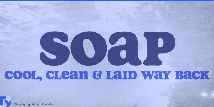
Soap was designed by Ray Larabie and published by Typodermic. Soap contains 3 styles and family package options.
Soap is a captivating unicase headliner which looks like Cooper Black but even smoother. It’s spaced really tightly and the bumps have been sanded all the way down. Soap‘s numerals align with the capitals and are flanked by ordinals and fractions. In OpenType adept applications, you can get your hands on an alternate lowercase-style T. Even though Soap was designed for headlines, in comes with a profusion of punctuation and mathematical symbols. Soap is available in a clean style as well as two grimy styles: Soap Stamp and Soap Spraypaint. In these particularly nasty transfigurations, common letter pairs are supplanted by straggly variations to help avoid plainly repeating letters.

