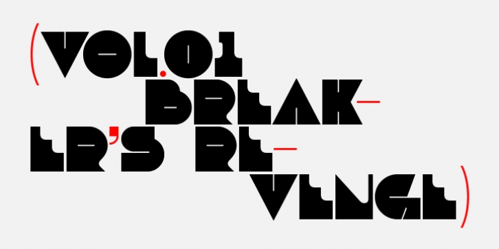
Debacle was designed by Michael Jarboe and published by Reserves. Debacle contains 3 styles and family package options.
Debacle is a super bold contrastive display face built upon pure geometric shapes. Sharp, angular lines are countered against obtuse rounded forms creating a striking visual discord. Select inner corners are rounded, giving characters dual attributes, while linear round-end counters simultaneously contrast and compliment the square-ended punctuation and symbols.
Stylistically, Debacle‘s prominent letterforms effortlessly create type-as-image text settings. Its style relates to the lush display typefaces from the seventies, yet is highly contemporary in its refinement and finish.
Features include:
Precision kerning
Basic Ligature set including ‘f’ ligatures (ae, oe, fi, fl, ffi, ffl, ff, fh, fj, ft, tt, th, ct, st, la, aj, fa, ls, es, ev, ew, tz, lv, lw, ti, it, ea, kv, ka, ky, yx, xy, yy, km, yw, wy, yv, vy, kw)
Alternate characters (O, Q, _, $, ®, •)
Slashed zero
Full set of numerators/denominators
Automatic fraction feature (supports any fraction combination)
Extended language support (Latin-1 and Latin Extended-A)
*Requires an application with OpenType and/or Unicode support.

