Klint was designed by Hannes von Döhren and published by Linotype. Klint contains 70 styles and family package options.
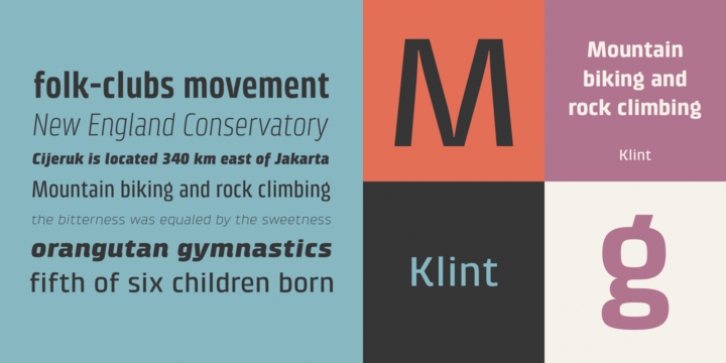
Type designer Hannes von Döhren created Klint. A sans serif typeface with a technical appearance and humanistic streak. The family includes five weights; each weight ships in three widths: condensed, regular, and extended. All of the 15 Klint variants have a companion Italic, rounding out family at 30 fonts.
Klint‘s large x-height makes the design especially legible at small point sizes. In today’s day and age, appliance manufacturers and/or companies in the mobile phone, computer hardware and software or Internet sectors are becoming ever more important.
Klint fills the rising need for superfamilies with a technical feeling that are also legible in both text and display settings. Through conspicuous letters like R, K, k, or g, as well as the independent nature of its Italic, Klint exudes an ethos that separates it from the competition.
Longer text passages in brochures, catalogs, or magazines would be well served by Klint‘s Light, Regular, and Medium weights. The heavier cuts are optimized for poster settings and headlines.’