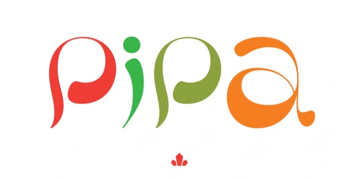
Pipa was designed by Patrick Griffin, Kevin King and published by Canada Type. Pipa contains 1 style.
Originally made for a health food store chain we cannot name, Pipa is the embodiment of organic display typography. Although it draws inspiration from some cold type ideas, like the uncredited Atlantis from VGC and a couple of older photo-lettering faces, its overall expression is right in line with what has become today’s vernacular in integrity organic display packaging.
Pipa‘s construct approaches the thick-and-thin idea from a rarely used perspective, where the flow in form contrast naturally seeps out from within each stroke, while minimizing the amount of strokes helps the totality of the setting come positively alive. This is bead and lava lamp psychedelia for the 21st century.
Pipa comes with plenty of alternates, including some very cool unicase variations, and extended Latin language support.

