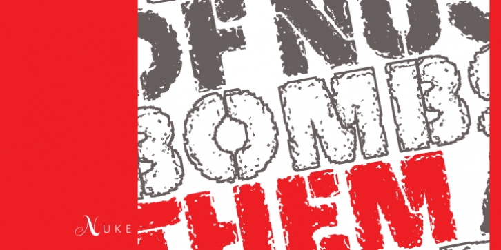
Nuke was designed by Patrick Griffin and published by Canada Type. Nuke contains 2 styles and family package options.
To grunge or not to grunge. Is grunge back? Maybe. Maybe it never left. Maybe it was just hiding around the corner waiting for the right time when it is needed again.
We have a theory that if grunge makes a comeback, it will be vastly different than its last incarnation. The mid- to late-1990s grunge had few statements, if any, to make about society, culture and the world in general. As visually appealing as some of it was, for the most part it was form for form’s sake, a misguided and mostly failed way of interpreting the old ‘medium is the message’ mantra. We believe that if a new wave of grunge is to surface now, it will have to make a much more poignant and artistic statement than it did in the 1990s, when grunge was really just a quick and dirty random collaging or filter distortions done in the name of experimentation. We think the only room left for grunge design is one where it is directly and purposely willful, not just ambiguously Kobain-esque or ‘trendy’. A pessimistic new wave of ‘reality destructuring’ design would be right at home in these early years of the 21st century, with threats of war and terror raging all over the world, natural disasters, class-based prejudices, government scandals, the public collapse of confidence in PR machines, entertainment and politics, and transparencies in human behavior becoming more obvious. No more will ‘experimentation’ be a sufficient explanation for a grunge design. If grunge makes a come back, it will have to be imaginative, relevant, original, and much harder work than random collaging or a conveyor belt-based software filtering process.
The two Nuke fonts were born from such reflections and hypotheses of cynicism.
Military and war ideas are quite evident from Nuke‘s underlying stencil construct. Additionally, the main Nuke style is a very original Frankenstein, with former stencil pieces rusted out and combined together to form the recognizable letter shapes. It can be made of steel or rock, you choose. It can be the post-apocalyptic remains of the world, or whatever sheet metal is left of a tank or bomb shelter, your call. Similarly, Nuke Bold can be water- and tread-eroded letters on the asphalt, or the final moment of letters on the verge of being pulverized and turning into nothing. Welcome to the new imaginative grunge, where the letters can be whatever your design needs them to be.
If on the other hand you want a very, very clean version of this font, check out the Quanta set, also by Canada Type. Quanta and Nuke complement each other very nicely in display work.

