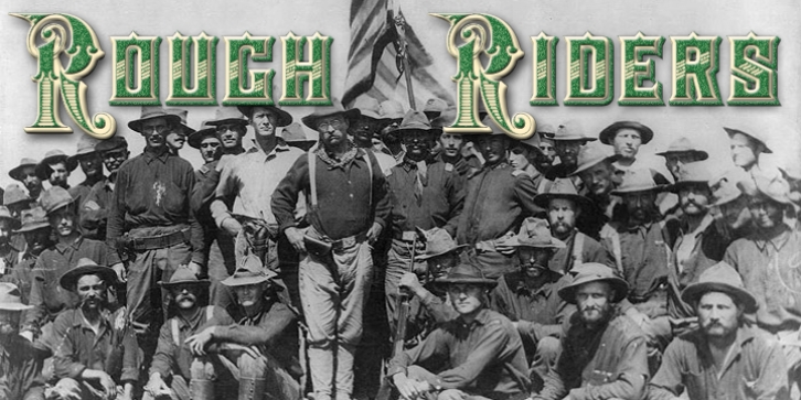
Rough Riders was designed by Michael Hagemann and published by FontMesa. Rough Riders contains 4 styles and family package options.
Rough Riders, along with our Rough Riders Redux font, got its start from a small sample of letters used in the logo for the Beach Creek Railroad Co. dating back to the early 1860’s. I studied the design for one year before drawing the letters.
Rough Riders and the Redux version are simply the most Wildest Western looking fonts you’ll find.
Fans of the new TV series called Copper will be interested in knowing that Rough Riders is the font used for the sign over Eva’s Paradise.
The Rough Riders fill font is not meant to be used as a stand alone black typeface, the fill font is designed to be layered behind the regular Rough Riders font.

