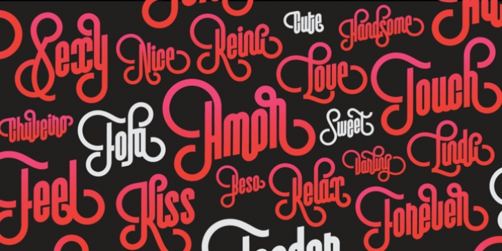
Vinyle was designed by Maximiliano Sproviero and published by Lián Types. Vinyle contains 4 styles and family package options.
Bold, rounded and super cool. Those are the attributes of my latest font “Vinyle“, french for vinyl.
In this epoque where all fields of Design are giving a lot of importance and attention to Typography and Lettering, I felt it was my duty to contribute with something that could really stand alone and ‘say something else’ that just words to be read.
I’ve found that lately in the world, regarding a finished piece of design, the role of Typography (and of letters in general) went from being secondary, (like a minor player or a supporting actor) to the most important one. People are starting to understand the beauty of a well-done letter: they want their storefronts with unique scripts, they want to drink coffee surrounded by lettered blackboards, they want to buy books with astonishing covers with swashes ‘por doquier’.
I’m more than happy to be alive in a present where even the most unimaginable friends of mine, (who couldn’t spot differences between comic sans and helvetica before) are now conscious of the importance of a letter, or let’s say: Of the ‘voice’ of Typography.
With Vinyle I tried to make a font with power. Following the nowadays trend of, let me say, “the vintage sans renaissance”.
This time I put my brushes and nibs aside and experimented with something new. It wasn’t easy, if you will pardon, for me to see swashes all over the place withouth the classic calligraphic ‘thick and thins’, but with after some weeks of work I started to love them.
Like I already showed you in other creations (1) let me finish with the phrase: GEOMETRY IS SEXY!
TIPS
Vinyle has a lot of attitude, it shouts “here I am!” it really can ‘design an entire piece’ for you with just a word or two: It was designed with a 10 degree slant on purpose so the user may rotate it (like on the posters) that amount of degrees in order to see better results.
Use Vinyle with the ‘fi’ standard ligatures activates for better kerning and ligatures!
NOTES
(1) See my font Selfie, the ‘little sister’ of Vinyle.

