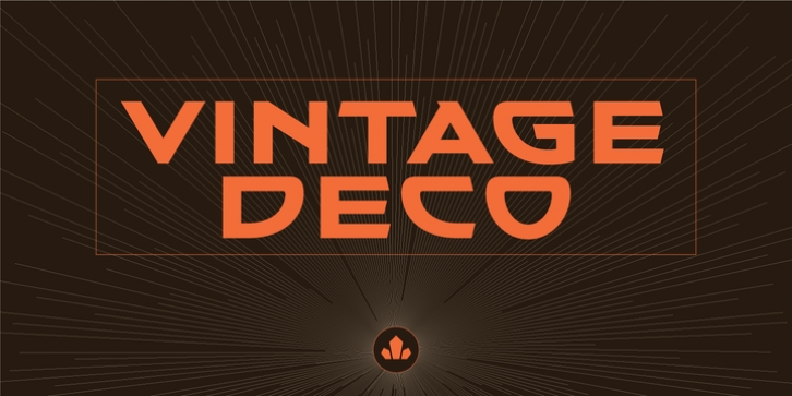
Vintage Deco was designed by Patrick Griffin and published by Canada Type. Vintage Deco contains 5 styles and family package options.
One of the most enjoyable activities at Typecon conferences is Paul Shaw’s lettering/type walk. Wherever the conference happens to be, and even if you’ve been to that city a hundred times and know it intimately, going on that walk with Paul & friends gives you a brand new, local-history-rich perspective. If you’ve never been to a Typecon conference, you owe it to yourself to go at least once just to have that fun experience.
Typecon 2016 was in Seattle, and the usual eye-opening walking adventure with Paul led us to the old sky-high vertical sign of the Vintage Hotel at Spring Street and 5th Avenue. Wide, breezy, unique caps with sharp cuts and wide semi-rounds. Letters of unknown origin, though brimming with that casual west coast chic. You could almost smell the hot rod fuel and optimism there. The late 1950s idea of futuristic. Almost like Bank Gothic or Microgramma gone totally deco. Hard not to get ideas when you see this stuff. The seed for Vintage Deco was planted, and the rest is now history.
The Vintage Deco family comes in five weights, from Light to Bold. The multi-script glyph set is quite extended. Each of the fonts contains 635 glyphs, Pan European language support, many stylistic alternates, and five types of figures. This is the kind of family that makes graphic designers seek out a project just to use the fonts in there.

