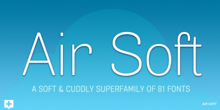
Air Soft was designed by Neil Summerour and published by Positype. Air Soft contains 81 styles and family package options.
Air Soft‘s development came as a natural progression in my exploration of Air’s skeleton. I wanted to see Air ‘softer’ in some of the test typesettings I was using during its development… so, well, I went about deriving a visual methodology to soften it. Early attempts had me producing solutions similar to all of the other ’rounded’ types. I rebelled against that. Had to. Ultimately, I wanted to show that you could put a radius on a corner without rounding it to oblivion. The solution is completely subtle and very intentional along each weight/style, but drastically changes the personality of the letters when contrasted against each other. Radii used to soften the letters were not interpolated across the range of weights but were rather derived independently to balance stroke and proportion.
The Air system began as an attempt to unify the prevailing traits of German and English Grotes(que/k)s in order to make something different but familiar. I am NOT trying to reinvent Helvetica (snore), so get that out of your system (get the pun). From the onset, I intended this typeface to be a true workhorse that offers infinite options and flexibility for the user. At its core, it is the maturation of the Aaux Next skeleton I developed years ago. I worked out Aaux Next to settle my issues and love for classic sans serifs. With Aaux Next, I strove to be mechanical, cold and unforgiving with it. I was single, young, cocky and it fit. Now I’m married, kids, dog and have found that I’ve turned into a big softy. When I look at Aaux Next (and have for the past few years) I see another typeface trying to eek out. I wanted it to avoid the trappings of robotic sans, quick tricks and compromises. The typeface’s DNA needed to be drawn and not just generated on a screen – so I set aside a year.
I love type. I love working with type. I hate when my options for a slanted complement is only oblique or italic. I set out to produce both to balance usage – there are more than enough reasons to prepare both and I want the user to feel free to consciously choose (and have the option to choose) the appropriate typeface for print, web, etc. That flexibility was central to my decision-making process. The Oblique is immediate and aggressive. The Italic was redrawn at a less severe angle with far more movement and, as a result, is far more congenial when paired with the Uprights.
Condensed and Compressed. Yep, why not? I know I would use them.
There are nine weights currently available. The logical progression of weights and the intended flexibility demanded I explore a number of light weights and their potential uses – this has produced a number of ‘light without being too light’ options that really work based on the size. The result is a robust 81-font superfamily that is functional, professional, and highly legible without compromising its personality. Pair that with over 900 characters per font that includes ligatures, discretionary ligatures, stylistic alternates, fractions, proportional/tabular lining and proportional/tabular oldstyle figures, numerators, denominators, ordinals, superiors, inferiors, small caps, case-sensitive functionality and extensive language support and you have a versatile superfamily well-suited for any project.

