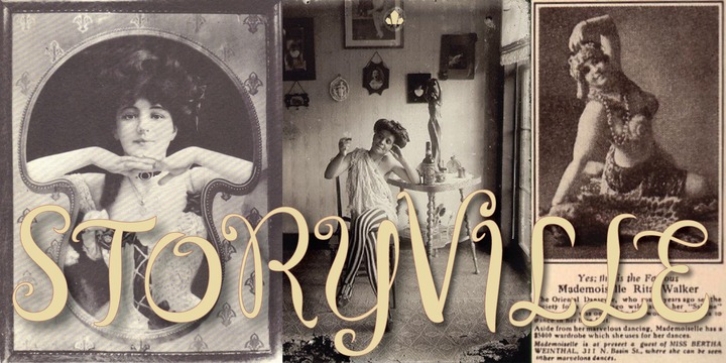
Storyville was designed by Rebecca Alaccari and published by Canada Type. Storyville contains 1 style.
This is the redrawn and expanded version of an alphabet Rebecca Alaccari made back in 2009 as a bespoke font for a tourism agency looking to recapture the appeal of New Orleans after the hurricane Katrina disaster robbed it of its core industries. The brief back then was to ‘revive the unique spirit of what always made Nola great for new adults, which is the excellent combination of history, romance, food and music.’ No word of a lie, the brief actually contained ‘new adults.’
Storyville contains two interchangeable sets of forms drawn in the doodly, loose and organic way now conspicuously popular with today’s young designers, almost every one of whom thinks they will get to design something for a boutique coffee bar somewhere. Well, this whole thing perhaps means freedom, youth, fun, happiness, good stuff like that. But just in case, a little caution doesn’t hurt: Use this font only if you know what you’re doing. We don’t want to go back to the 1990s. Please. We were nearly done for by that exposure the first time around.
The ligatures feature in this font does some pseudo-randomization, so the forms in doubled letters don’t repeat. Serious fun can be had by also applying the stylistic alternates feature, or picking a letter in the middle of a setting and disabling the ligatures feature. Or various sequences of all that. If you don’t like any of that stuff, just forget about it. Uh, wutever.

