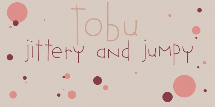
Tobu was designed by David Kerkhoff and published by Hanoded. Tobu contains 1 style.
Tobu means ‘to jump’ in Japanese. I came across a haiku by Matsuo Bashô wich reads: The old pond… a frog jumps in… the sound of water (Furu ike ya… kawazu tobikomu… mizu no oto). The font is named Tobu because of its jumpy character: it doesn’t have a real baseline, which makes it playful and fun to use. Tobu comes with a pond full of diacritics.

