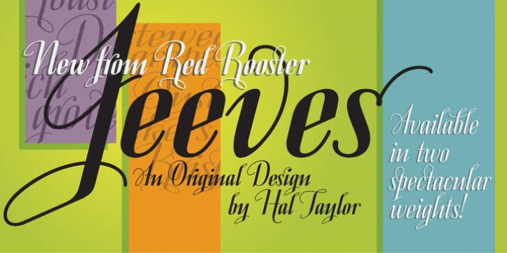
Jeeves was designed by Hal Taylor and published by Red Rooster Collection. Jeeves contains 2 styles and family package options.
The inspiration for Jeeves came from Leslie Carbarga’s wonderful book LETTERHEADS, One Hundred Years of Great Design, 1850-1950. It was based on a secondary type usage for the letterhead for Sutherland in New York. The rest of the letterhead had features that were more typical of the Art Deco period, but this script added a touch of timeless elegance. And since at the time I was reading every scrap of P.G. Wodehouse I could get my hands on, the name Jeeves seemed like a perfect fit.
The font is loaded with a plethora of extra glyphs, ligature characters and OpenType features.

