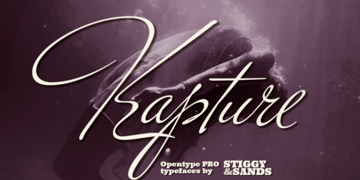
Kapture was designed by Jim Lyles, Brian Bonislawsky and published by Stiggy & Sands. Kapture contains 1 style.
There are script typefaces that embody sensuality, and our Kapture typeface is now amongst that collection. From its thin weighting to its effortlessly flowing strokes, and a visual rhythm between quick and slow movements, Kapture truly captures a romance in letterforms.
Stylistic Alternates offer a change-up set of Capitals, while the Contextual Alternates feature plays with intro and final lowercase letterforms to visually mix things up a bit. Elegant, fashionable, sophisticated, sensual, and celebratory all at once. Kapture is a typestyle that finds itself at home in any design where a refined yet modern script is required.
Kapture is loaded with features to give you plenty of customization options:
– Stylistic Alternates for a collection of alternate Capitals
– Contextual Alternates for alternate starting and ending lowercase letters
– 110 Ligatures to make typesetting more dynamic
– Ornaments to place before and after words or phrases for even more flair
– A Full set of Inferiors and Superiors for Limitless Fractions
– Proportional and Oldstyle numeral sets

